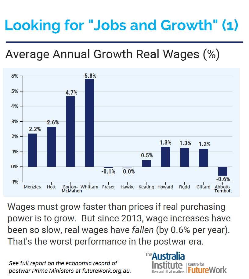
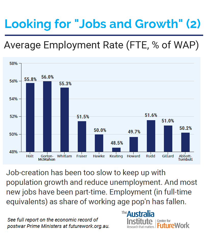
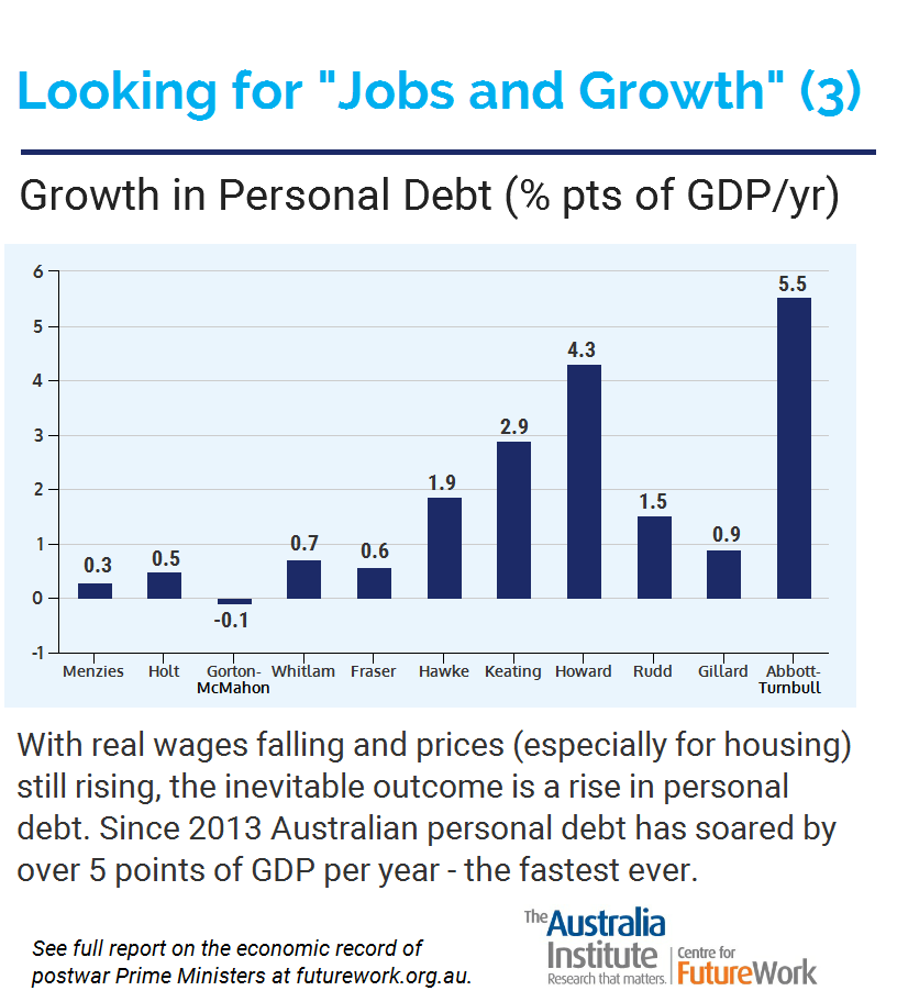
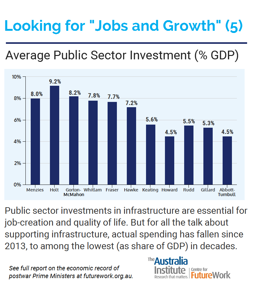
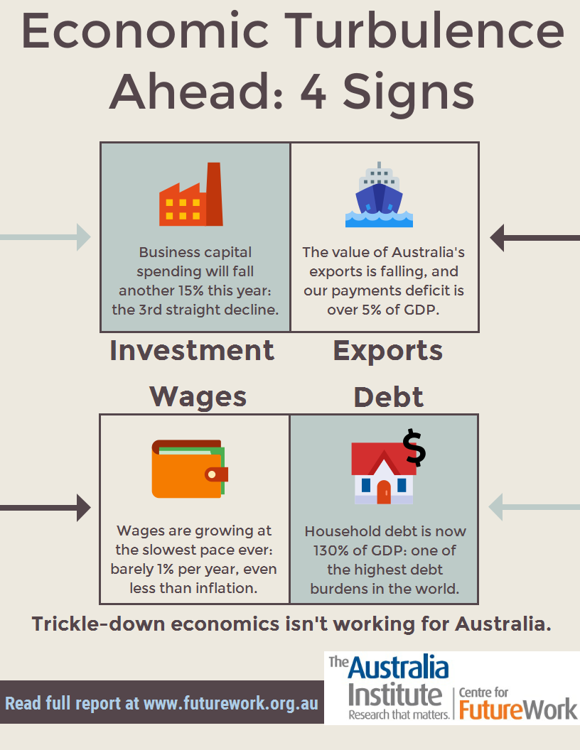
Looking for “Jobs and Growth”: Six Infographics
We have prepared six shareable infographics based on material in our research paper, “Jobs and Growth… and a Few Hard Numbers,” which compared Australia’s economic performance under the respective postwar Prime Ministers.
The infographics summarize several of the specific economic variables considered in the full report, dating back to 1950 (and Prime Minister Menzies) in most cases.

Related research
Between the Lines Newsletter
The biggest stories and the best analysis from the team at the Australia Institute, delivered to your inbox every fortnight.
You might also like

Is population growth driving the housing crisis? Here’s the reality
Population growth is in the news again. The usual suspects are trying to whip up a scare campaign about immigration. So, let’s look at the actual numbers and put them into context.
Creating more jobs from the stimulus package
As many as 20,000 full-time jobs could be created for just $1 billion according to a submission by The Australia Institute to the Senate inquiry into the Government’s proposed stimulus package. For $42 billion the government is only expecting to sustain 90,000 jobs over two years, which is $233,000 per job per year. At just
Queensland’s quiet jobs boom
New report shows service industry jobs growth outstripping mining job losses. Despite record job losses in the mining sector, employment in Queensland is growing strongly with service industries leading the way, according to a new report released today by The Australia Institute. Queensland’s service industries were standout performers in recent years, and are expected to